
Discipline on the front end. Direct routes under the hood. No rainbow gradients, no clutter, no wasted motion.
Black / White / On-chain
Late-night signal
Urban grayscale asset
Atmosphere
Not loud. Not soft. Just unmistakable.
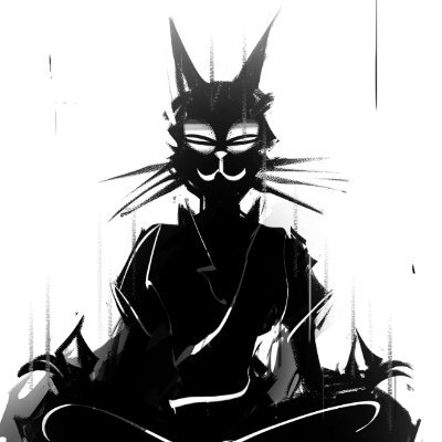
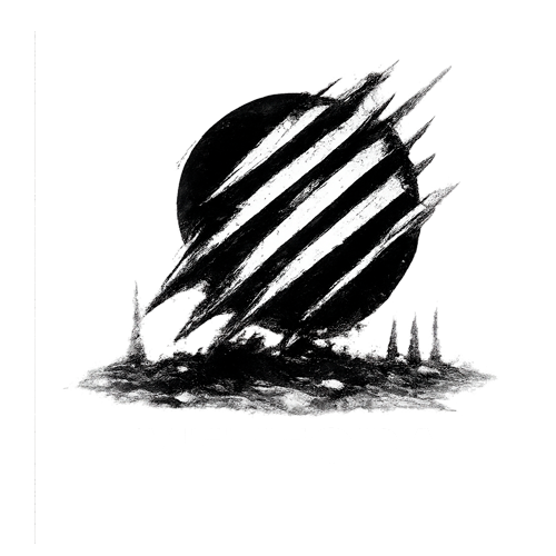
ZEN benefits from imagery that already understands restraint. The site uses that directly: one meditative icon, one wide banner, one cinematic street frame. Together they create a narrative without forcing a fake lore dump.
The result is closer to a sharp brand landing page than a template crypto microsite. The visual pacing stays slow, but every route to the market remains one click away.
Enter The Feed